The Evolution of Kirby's Image: From "Angry Kirby" to Global Consistency

This article explores the fascinating evolution of Kirby's marketing and localization, revealing why the adorable pink puffball sported a noticeably tougher look in Western releases compared to his Japanese counterparts. Former Nintendo employees shed light on the strategic decisions behind this transformation.
The "Angry Kirby" Phenomenon:
The "Angry Kirby" moniker, coined by fans, reflects a deliberate shift in Kirby's presentation in Western markets. Leslie Swan, former Nintendo Localization Director, clarifies that the goal wasn't to portray anger, but rather a sense of determination. While cute characters resonate universally in Japan, Swan notes a preference for tougher characters among American tween and teen boys. Shinya Kumazaki, director of Kirby: Triple Deluxe, corroborates this, highlighting the contrasting appeal of cute versus strong Kirby in Japan and the US respectively. However, he also points out that this isn't universally true, citing Kirby Super Star Ultra's consistent box art across regions.
Marketing Kirby as "Super Tuff Pink Puff":
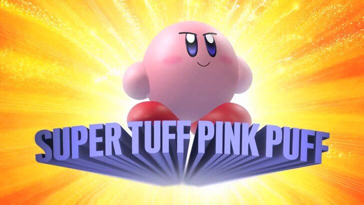
Nintendo's marketing strategy aimed to broaden Kirby's appeal, particularly among boys. The memorable "Super Tuff Pink Puff" tagline for Kirby Super Star Ultra (2008) exemplifies this. Krysta Yang, former Nintendo of America Public Relations Manager, explains Nintendo's desire to shed its "kiddie" image during that era, highlighting the perceived negative impact of such branding. This led to a conscious effort to emphasize Kirby's combat abilities and portray a tougher persona. While recent years have focused more on gameplay and abilities, Yang acknowledges that Kirby's cuteness remains his primary association for many.
Regional Localization Differences:
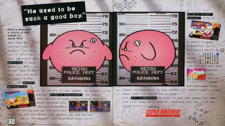
The divergence in Kirby's localization began early. A 1995 "Play It Loud" advertisement featuring a mugshot-style Kirby is a prime example. Subsequent years saw variations in box art, with titles like Kirby: Nightmare in Dream Land (2002), Kirby Air Ride (2003), and Kirby: Squeak Squad (2006) showcasing Kirby with sharper features and more intense expressions. Beyond facial expressions, even Kirby's color was altered. The original Kirby's Dream Land (1992) for Game Boy featured a desaturated Kirby due to the system's monochrome display, a decision that later impacted marketing strategies. Swan explains the challenges of marketing a "puffy pink character" to a target audience seeking "cool" imagery.
A Shift Towards Global Consistency:
Swan and Yang agree that Nintendo's approach has become increasingly globalized. Closer collaboration between Nintendo of America and its Japanese counterpart has led to more consistent marketing and localization. Regional variations like the differing Kirby box art are becoming less common, as is the risk of campaigns like the 1995 advertisement. Yang acknowledges the trade-offs, suggesting that global consistency, while beneficial for brand recognition, can sometimes lead to less engaging, more generic marketing. The current trend, according to game localizers, reflects broader industry globalization and the increasing familiarity of Western audiences with Japanese culture.


![Amy’s Ecstasy [v0.45 Final]](https://imgs.daqiang.cc/uploads/07/1719551527667e462789d0f.jpg)