Is Civilization VII's UI as Bad as Advertised? A Critical Examination

Civilization VII's Deluxe Edition debuted, and online discussions immediately focused on its UI and other shortcomings. But is the user interface truly that flawed? This analysis dissects the game's UI elements to determine if the online criticism is justified.
← Return to Sid Meier's Civilization VII main article
Assessing Civ 7's UI
Early access players of the Deluxe and Founder's Editions have voiced strong opinions, particularly regarding the UI's perceived shortcomings and missing quality-of-life features. However, a balanced assessment is needed to determine if the criticisms are accurate. We'll examine the UI's components to see if it meets the standards of a functional 4X game interface.
Defining a Successful 4X UI
While arguments exist for objectively superior 4X UI designs, the reality is more complex. A UI's effectiveness depends on the game's context, style, and goals. However, design principles consistently found in successful 4X UIs provide a framework for evaluation. Let's assess Civ 7's UI against these key elements.
Information Hierarchy
A clear information hierarchy prioritizes accessibility and importance. Essential resources and mechanics should be prominent, while less critical features remain easily accessible. The UI shouldn't display everything simultaneously but should organize information logically.
Against the Storm's building info menus exemplify this. Right-clicking a building reveals a multi-tabbed menu, prioritizing common actions (worker assignment, production) in the default tab, while less frequent functions are in subsequent tabs.
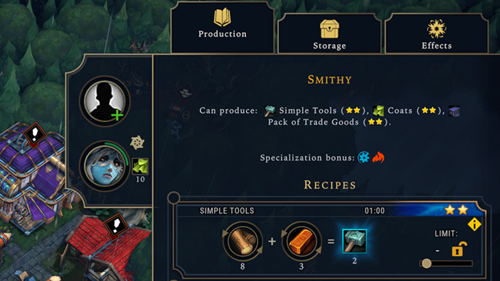
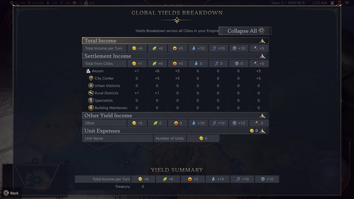
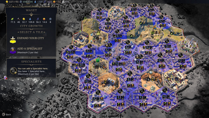
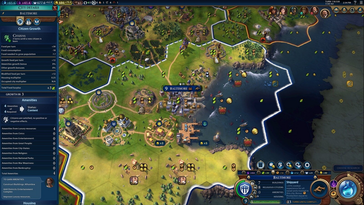
Civ 7's resource summary menu presents resource allocation, separating income, yields, and expenses via dropdowns. The table format is efficient, and the menu collapses easily. However, it lacks detailed specificity. While overall resource generation from rural districts is shown, precise district or hex origins aren't displayed. Expense breakdowns are also limited. The UI functions adequately but lacks granular detail.
Visual Indicators
Effective visual indicators (icons, colors, overlays) convey information quickly. A good UI uses these to communicate data without relying on text or numbers.
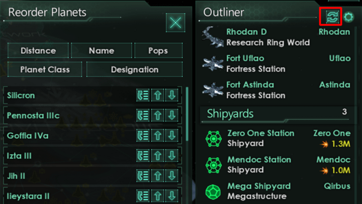
Stellaris's Outliner, despite its cluttered UI, uses visual indicators effectively. At a glance, players understand ship status (transit, scanning, etc.). Icons indicate colony needs, minimizing clicks.
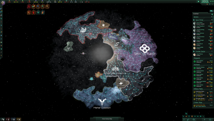
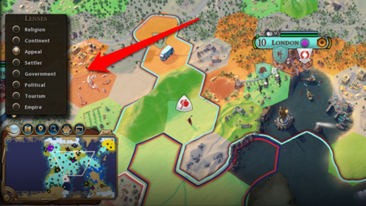
Civ 7 utilizes iconography and numerical data. The tile yield overlay, settlement overlay, and settlement expansion screen are effective. However, the absence of certain Civ 6 lenses (appeal, tourism, loyalty) and customizable map pins are criticized. While not terrible, improvement is possible.
Search, Filtering, and Sorting
Search, filtering, and sorting are crucial for managing information in complex 4X games. These features streamline navigation.
Civ 6's powerful search function allows players to locate resources, units, and features on the map. Its Civilopedia links entries to in-game elements.
Civ 7 lacks this search function, a significant usability drawback. Its absence is a major criticism. Improved Civilopedia functionality is also desired.
Design and Visual Consistency
UI aesthetics and cohesiveness are crucial. A poorly designed UI can detract from the overall experience.
Civ 6's dynamic, cartographical style integrates seamlessly with the game's aesthetic.
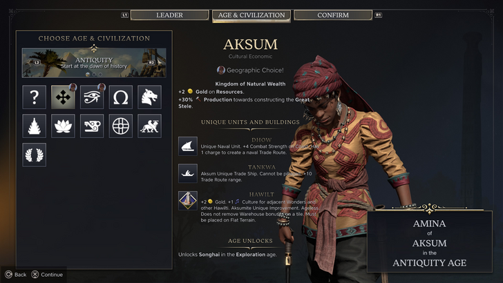
Civ 7 adopts a minimalist, sleek design. The color palette (black and gold) is sophisticated but less visually striking than Civ 6. This subtle approach has resulted in mixed reactions, highlighting the subjective nature of visual design.
Conclusion: Not as Bad as Claimed
Civ 7's UI, while not perfect, isn't as disastrous as some suggest. The lack of a search function is a significant omission, but not game-breaking. Compared to other issues, the UI's flaws are relatively minor. While it falls short of some visually impressive 4X UIs, its strengths should be acknowledged. With updates and player feedback, the UI's shortcomings can be addressed. Currently, it's not as bad as the widespread criticism implies.
← Return to Sid Meier's Civilization VII main article
Similar Games